.svg)


.png)


I still remember when I joined Giskard three years ago. One of the things that caught my eye was the branding, it was very unique. It stood out from other tech companies in the space and had a clear spirit and identity: a unique, smiling sea turtle.
However, there was a missing piece; something felt off. The turtle was nice, and the choice of colours was unique in the space (where tech brands almost always go for blue and purple shades), but somehow it felt disconnected from who we wanted to be as a company. We were lacking that tech-professional style. Our mascot looked a bit too cartoonish, and don’t even get me started on the typography.
So yeah, we had some issues we needed to solve to create a brand that matched who we are. A year ago, we finally decided to start this quest (because yes, rebranding is not a piece of cake, spoiler alert: it takes months!). This is the story of how it all happened.
Finding the problems: what to keep and what to change
We first needed to define who we are as a team and as a company, plus a very important point: how we wanted our community to perceive us. In that sense, it was key to sit down with some of our customers to understand what they liked (or didn't like) about our branding, and what they thought and felt when they first saw it.
It became clear that our community liked the friendly vibe our turtle and style conveyed. We seemed like an approachable team, open and easy to discuss things with. On top of that, our logo was very easily recognised.
Ok, so that matched pretty well with our team values! We want to be friendly and empathetic, letting people know they can trust us.
What we were missing was a way to showcase another one of our core values: our expertise in high-level AI security and our deep tech product. So the question was: how could we combine the friendly turtle spirit with that more professional touch? We wanted to avoid all the clichés in the tech space: the same pattern of colours, the cold and soulless design... you get the picture, right?
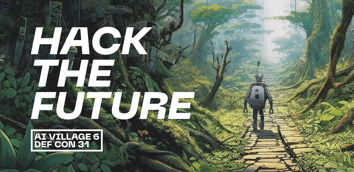
So, it was time to call for reinforcements! For this project, we were lucky to work with the designer Ray Marrero. For those who don’t know him, we met him at DEFCON 31, where he worked on the art style for the AI Village.
Besides working on the values and style we wanted to convey with our design, there were other key topics to cover with this rebranding, such as having a consistent brand design that is easy to use in different formats while remaining recognisable (and believe me, working in marketing and product, this was a true pain).
From pains to a first true direction
For anyone who has worked on a branding (or re-branding) project, you know how long this process can be: writing the brief, analysing trends, exploring different directions, polishing every detail… But it’s important to take the time to properly build your brand, because at the end of the day, this is our "home", where we all work at Giskard and where our community lives.
Stéphane, our Frontend designer, and I were ready for the challenge!
With Ray, we came to the same conclusion: if we wanted to differentiate ourselves in the AI tech space, we needed to stay in the shades of green. But of course, there was room for improvement in the shades we were using at that point, which were too bland and lacked a bit of personality.
We explored different directions and green combinations until we found the perfect balance: a dark teal green as our main tone, and a brighter, acid green variant. Then we brought in a fresh cyan as a complementary colour, which will be mainly used for actions and interactive elements.
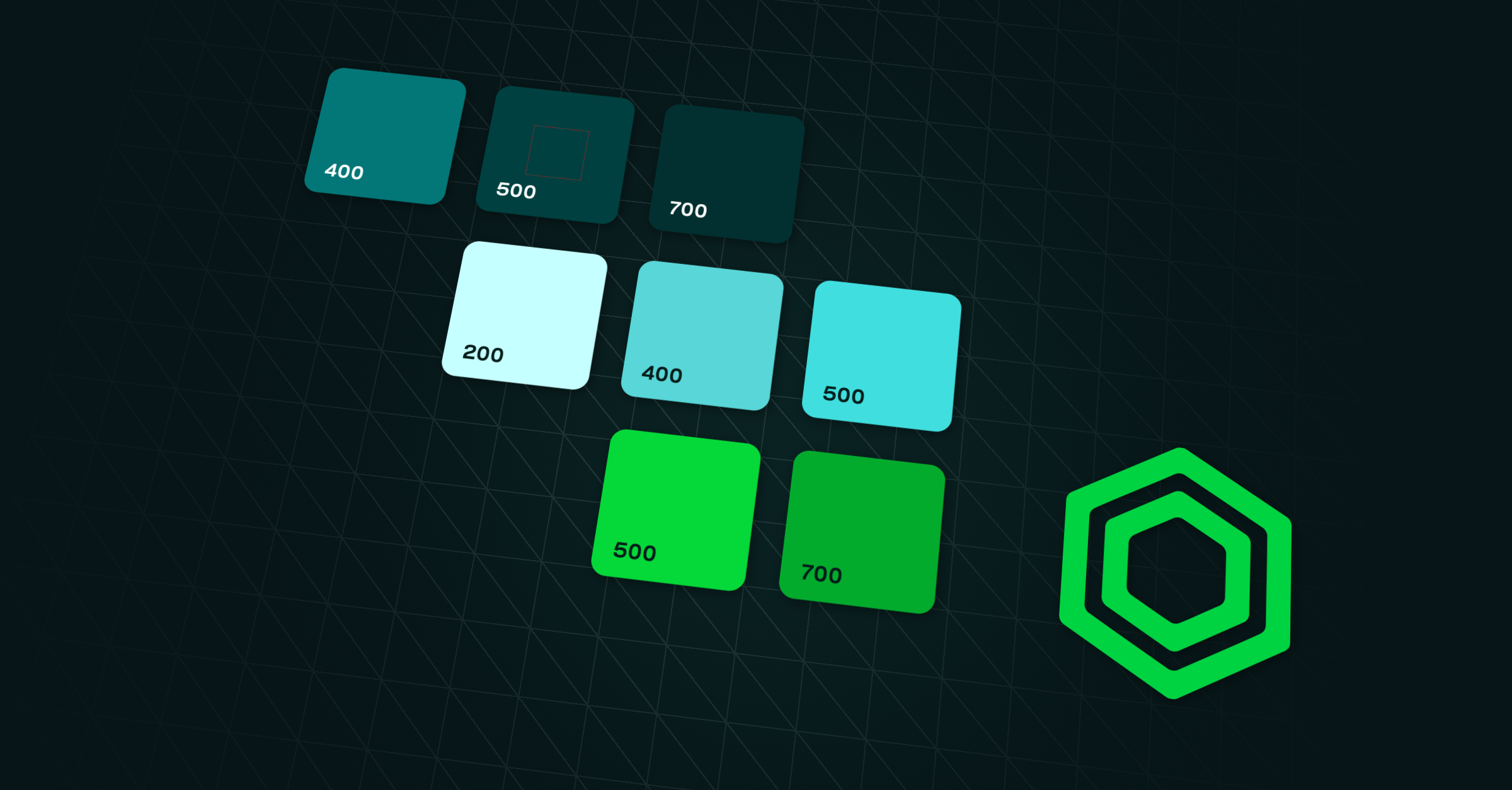
After that, we designed a custom shape made of nested hexagons to represent security and reliability, two key ideas behind Giskard’s values.
At this point, we had that part of the issues covered: the brand colours and hexagon were still unique, had more personality, and could build a consistent and recognisable system. But there was still much to do! What about the logo, the fonts? And, of course, where does our turtle mascot fit in here?
We were getting somewhere: refreshed logo and new font family
We knew our logo was very recognisable and our community liked it, so it was clear we needed to do a refresh while keeping it true to its essence. And we shouldn’t forget about the friendly, approachable style our community liked so much. So our new logo needed to strike a balance: approachable enough to connect, but sharp enough to trust.
Now, time for the font. When we started this project, little did I know how much I was going to learn about this topic. Working in marketing, yes, of course, you have a basis in design and I knew typography is very important, but I was certainly not an expert in the matter. Luckily for us, Matteo, our CTO, knew everything about it! I remember the discussions we had, the impressions he shared with us about the first time he saw the Parisine font in the metro, and the nice book he recommended to us (The Elements of Typographic Style by Robert Bringhurst).
We iterated a lot with Ray on this topic, exploring different fonts like Bebas or IBM Plex, until we found the Osmose family. Osmose’s clean, geometric yet humanist design perfectly embodies Giskard’s values of clarity, reliability, and innovation. Its balanced forms and subtle details reflect our commitment to building trustworthy, inclusive AI solutions with a modern, approachable spirit. We liked it so much that we decided to use it in our logo too.
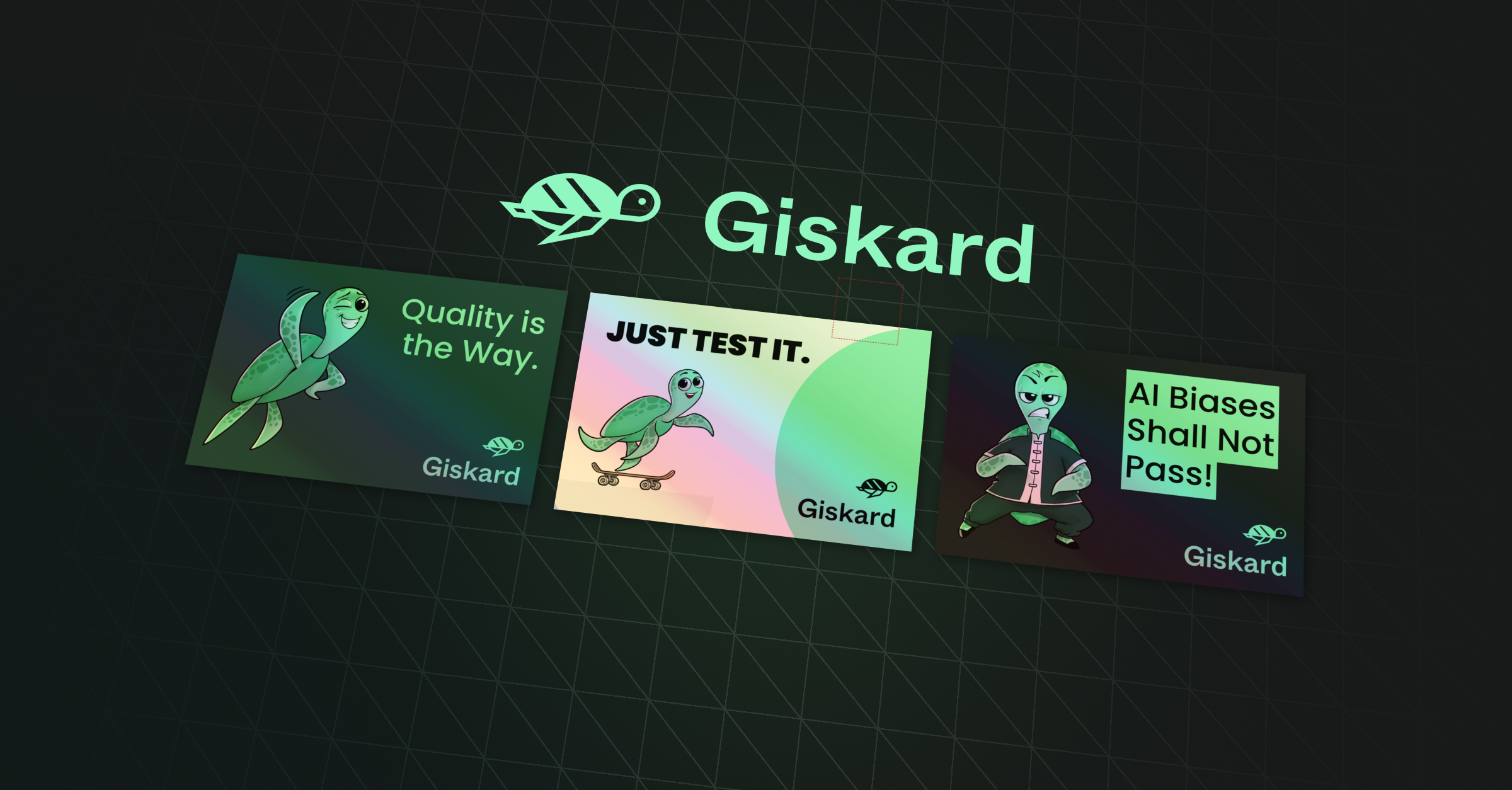
And the last piece: Sophia, the turtle!
As I already mentioned, everyone seemed to like our turtle mascot, Sophia, as she is the friendly face of Giskard. By the way, if you ever wondered why we decided to have a turtle as a mascot, you should read this blog post from our early days :)
For this redesign, we wanted Sophia to still feel friendly, but look more high-tech and reliable, like someone you could trust with your AI security. And of course, we wanted to stay away from clichés like having a robot-turtle!
We then decided to work with a talented designer, Roman Manchenko, who had experience in creating 3D tech mascots. He helped us define the new identity of Sophia: a leatherback sea turtle who is wise, agile, and has a shell made of a glowing circuit board to show Giskard’s transparency and expertise.

Giskard.ai revamp & the Hub redesign
Once the brand base was ready, it was time to say goodbye to the old, bland website. We started fresh with a new design that follows today’s standards. We picked a dark theme that feels more modern and technical (yes, my eyes won’t hurt anymore with a light theme!), a better fit for what we build. We added colour accents on titles, more structured layouts, and some subtle interactive loops to showcase Giskard’s products.
After the brand release, we quickly applied the new identity to the Giskard Hub, our main B2B platform that still had the old unbranded look. We kept the same structure and layout but refreshed everything with the new logo, font, and colour palette. It now looks much more consistent and gives the product a sharper, more professional feel.

Wrapping up!
So yes, as you can guess after reading this long post, it was a long process, but we couldn’t be happier with the result! This rebranding has let us take Giskard to the next level, where the brand feels more professional, more aligned with a tech product (without falling into clichés!), and stays true to its nature: your friendly neighbour (spider-man) the turtle!
All of this wouldn’t have been possible without the help of some amazing people:
- Stéphane: Our Frontend designer, who co-led this project with me, and whose designs always look amazing (so pro!).
- Ray Marrero: What a nice coincidence to meet you during DEFCON! Thank you for guiding us in this rebranding and helping us find the right direction.
- Roman Manchenko: Who transformed Sophia into an agile, smart, and friendly turtle.
- Matteo: Yes, thank you for your eye for detail, and for showing us the way of typography.
- Arthur Vu: Our Webflow expert, who is always able to translate every design to our website. After so many years working together, you’re part of the family!
- Alex and JM: The Giskard founders! Thank you for trusting us during this process and letting us help you build the brand together.
And of course, thank you to all Giskard users, followers, and everyone who is supporting this project :) None of this would be possible without you!

.png)
